Vue 3 Popup Modal Component – Create a Modal
By Dillon Smart · · · 0 Comments

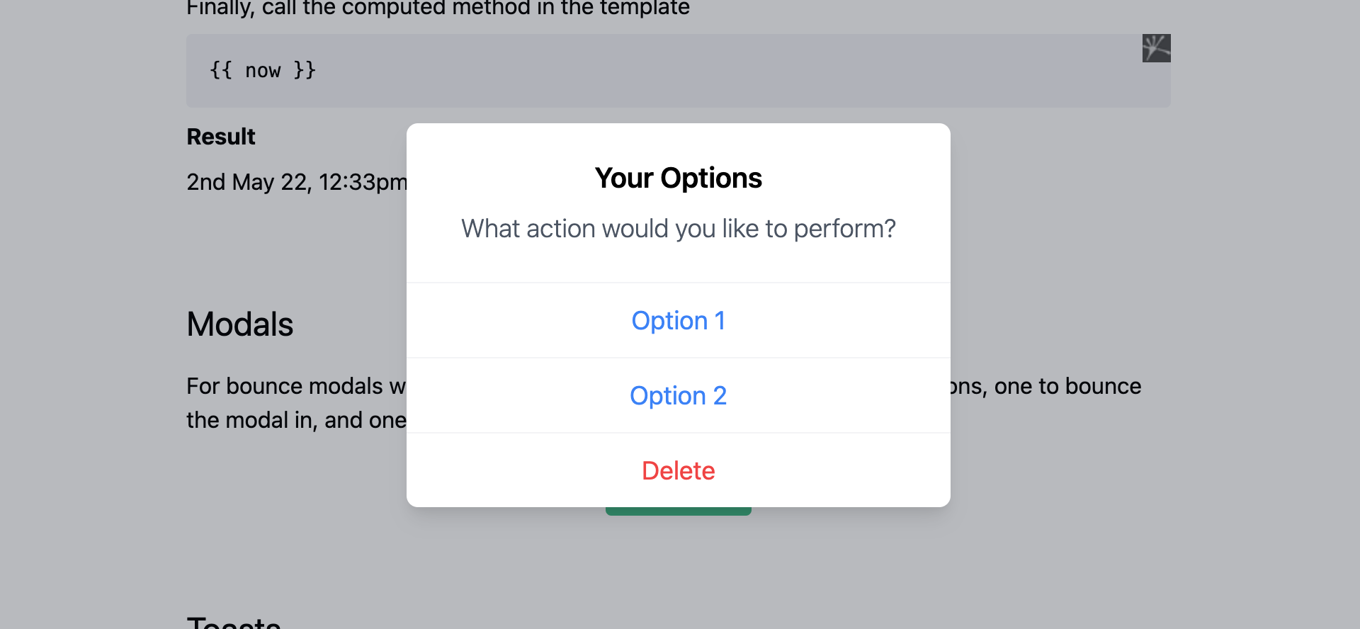
In this post, I’m going to show you how to create a Popup Modal Component in Vue 3. This Popup Modal will use the built-in transition component. The Modal we will create looks a lot like the Modal Dialogs used by Apple in iOS. We will use Tailwind CSS for styling.
What is Vue?
Vue is a JavaScript framework for building user interfaces. It provides a declarative and component-based programming model which is great for user interfaces both simple and complex.
Vue has been raising in popularity since its release in 2014, and is now in the top 3 JavaScript frameworks alongside Angular and React.
Vue 3 Modal Example
I have created a repository with this functionality included here: https://github.com/Dillonsmart/vue-quickstart. The repository includes other functionality, such as state management and persisted data.

Create a Popup Modal Component in Vue 3
First, under the components directory, create a new file called TheModalComponent.vue. This component is where we write all the code for the Modal in Vue. The component contains the HTML markup used in the template, with scoped CSS.
<template>
    <div>
        <div class="h-full w-full fixed top-0 left-0 z-20" v-on:click="hide"></div>
        <div class="bg-white rounded-lg text-lg pt-6 shadow-lg w-96 fixed top-1/2 left-1/2 transform -translate-x-1/2 -translate-y-1/2 z-30">
            <div class="px-6 pb-6 text-center">
                <h3 class="text-xl mb-2 font-semibold">Your Options</h3>
                <p class="text-gray-600 font-light">What action would you like to perform?</p>
            </div>
            <ul class="cursor-pointer border-t border-gray-100 text-center">
                <li class="border-b text-blue-500 border-gray-100 w-full px-6 py-3 hover:bg-gray-100">Option 1</li>
                <li class="border-b text-blue-500 border-gray-100 w-full px-6 py-3 hover:bg-gray-100">Option 2</li>
                <li class="w-full text-red-500 px-6 py-3 rounded-b-lg hover:bg-gray-100">Delete</li>
            </ul>
        </div>
    </div>
</template>

<script>
export default {
    name: "TheModalComponent",
    methods: {
        hide() {
            console.log('click registered');
            this.$emit('close')
        }
    }
}
</script>

<style scoped>
.bounce-enter-active {
    animation: bounce-in .5s ease-out both;
}

.bounce-leave-active {
    animation: bounce-in .5s reverse ease-in both;
}

@keyframes bounce-in {
    0% {
        transform: scale(0);
    }
    50% {
        transform: scale(1.10);
    }
    100% {
        transform: scale(1);
    }
}
</style>
Use the Component in another Component
To use the Popup Modal Component in your Views or other Components, call it using the name of the component split by hyphens. To use the transition bounce, wrap the component in the transition component like so:
<transition name="bounce" mode="out-in">
    <the-modal-component></the-modal-component>
</transition>
Summary
You have now successfully created a Vue3 modal!
Vue js ships with many useful features for frontend developers. Using transitions in Vue, we have built a modal popup that looks and feels like native modal dialogs on iOS devices.
If you need any help creating a Vue 3 Popup Modal Component, feel free to leave a comment.
Do you use Vue in your Laravel Application? Learn how to use environment variables in Vue.
0 Comment