5 Tools to test website responsiveness
By Dillon Smart · · · 0 Comments
If you are concerned with providing a great experience to users and potential customers on mobile devices, or you are concerned with your SEO rankings, then you need a reliable way to confidently test website responsiveness.
- How website responsiveness affects SEO
- Using your browsers Developer Tools to test responsiveness
- Google Page Insights
- Responsive Checker
- Responsive Chrome Extension
- Lambda Test
How website responsiveness affects SEO
It is widely known that search engines rank websites higher if they perform well on mobile devices. A responsive website design helps search engine algorithm’s index the information on and about the page more accurately.
An important thing to know is that search engine indexing is not the same as ranking. However, you are unlikely to rank high if web crawlers cannot properly index your site
Tools to help you test website responsiveness
Here are 5 great tools to help you test and identify issues with your websites responsivity:
Browser Developer Tools
Every major web browser provide a suite of developer tools to aid in testing website perfromance, interacting with loaded resources such as HTML, CSS and JavaScript, or testing responsiveness.
As Developer Tools are baked into all modern web browsers, there is no charge for using the tools.
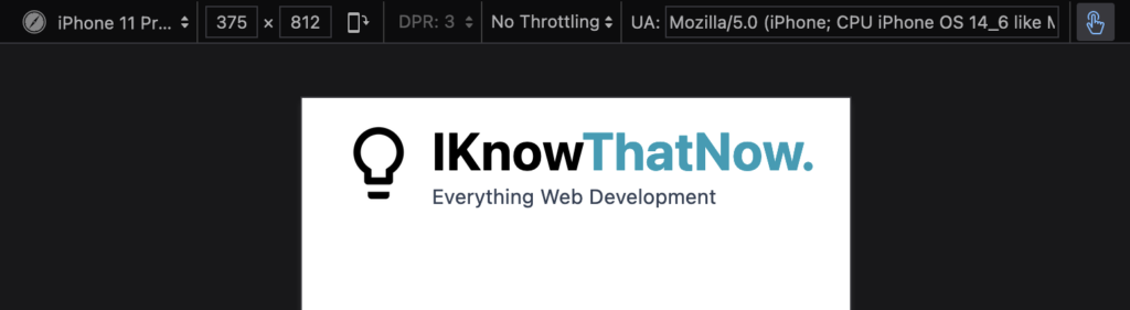
How to open Developer Tools in Google Chrome
To open Developer Tools in Google Chrome, open the Chrome Menu in the upper-right-hand corner of the browser window and select More Tools > Developer Tools.
You can also use the keyboard shortcut to open the Developer Tools by using ⌘ + Option + I (on macOS), or Shift + CTRL + I (on Windows/Linux).
How to open Developer Tools in Firefox
You can open the Firefox Developer Tools from the menu by selecting the Menu from the top right > More Tools > Web Developer Tools or use the keyboard shortcut ⌘ + Option + I (on macOS), or Ctrl + Shift + I or F12 (on Windows/Linux).
How to open Developer Tools in Safari
To open Developer Tools in Safari, from the Menu bar select Safari > Preferences/Settings or use the keyboard shortcut (⌘ + ,).
Once the preferences window has opened, select Advanced and check the tick box labelled “Show Develop menu in the menu bar“.
From the Menu bar, select Develop > Show Web Inspector or use the keyboard shortcut (⌥ + ⌘ + I).
How to open Developer Tools in Microsoft Edge
In Microsoft Edge, you can open the Developer Tools using the shortcut Ctrl+Shift+I (Windows, Linux) or ⌘ + ⌥ + I (macOS). You can also press F12.
In MacOS, and alternative option to open the Developer Tools is to select Tools from the Menu Bar, then select Developer > Developer Tools.
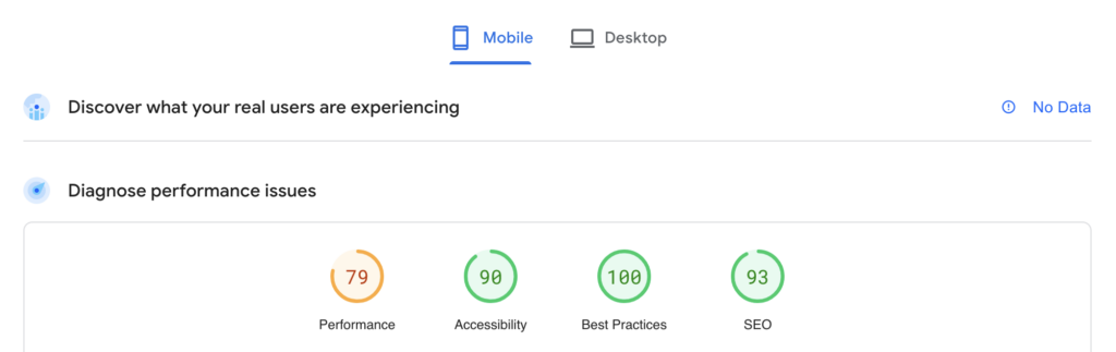
Google Page Insights
Page Insights is a great tool from Google to test and analyise user experience of a page on both mobile and desktop devices, and provides suggestions where the webpage can be improved.
Improvements suggested for responsiveness can include text being too small on mobile devices to buttons being too close together, making them difficult for users to click with accuracy on smaller screens.
Reports from Page Insights cover a range of areas, such as:
- Accessibility
- Performance
- SEO
- Best Practices
These reports also cover Core Web Vitals. We explained Core Web Vitals, and the importances or Core Web Vitals in a pervious post.
Here is an example report on how IKnowThatNow performs.
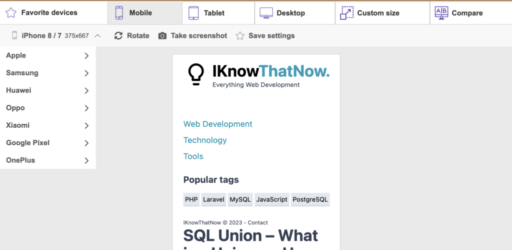
Responsive Checker by Website Planet
WebsitePlanet have built an intuitive website respovitity testing tools which gives familiar testing abilities to Browser Developer Tools with the addition of some pretty useful features.
Using the compare tool provided, you can test and compare your websites responsiveness on multiple devices at once.
Responsive Tester Chrome Extension
The Responsive tester Chrome Extension is a great tool which loads the current active tab in a responsive popup window for testing.
We like this tool as it doesn’t require the need to remember how to open Browser Developer Tools, and is always only 1 click away.
Lambda Test
Lambda Test offer a full cloud testing platform with native mobile testing, on real world devices.
With the Lambda Test free plan, you will have access to:
- Live real time testing
- 200+ Desktop Browsers
- 10 Screenshot Tests per month
- 10 Responsive Test per month
- 3 sessions of Native App Testing on Emulators/Simulators
Conclusion
In this post we have highlighted 5 free ways to test website responsiveness. Using these tools, you can confidently build and ship websites that look and perform great on a range of different screen sizes and devices.
0 Comment